Photoshop Text Effects: Easy Plastic Text with Layer Styles
The acrylic text effect is a fun and easy way to add some pizzazz to your design – especially when you’re trying to create a scrapbook style with lots of layers. It’s easy enough that anyone can do it, but it looks complex and interesting!
What is a Layer Style?
Layer styles are a feature of Photoshop that allows you to create custom effects on a particular layer. Essentially, they’re like presets that you can apply to any layer. You can use them to change the appearance of text, borders, and other elements without having to redraw the entire piece each time.
For example, this image is a bit of text on a color gradient background. I’ll add a layer style to the text to make it red and white, and then I’ll select that text and move it up to other layers. When I get back to the original layer, everything will be updated automatically.
Layer Styles Basics
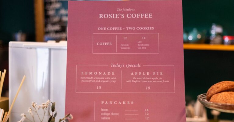
The most basic use of layer styles is to apply them to individual objects. For example, let’s say that we have this menu text set on our menu background:
We can apply a red outline like so:
Then when we go back and look at the menu, this is what we see:
What if we want a different effect?
That’s where pattern fills come in.
For example, let’s say we have a few menus with the same content, but one of them has a different background:
And let’s just say that it would look better to have the text on this menu to have the pattern fill:
This can be done by selecting the desired layers and applying a pattern fill. It will automatically apply to those layers:
The only downside is that you must remember to start from scratch if you decide to edit your layout. If you accidentally delete a layer style, go back and re-apply it before you save for every change.
Fills are similar to patterns except they do not include any text. Instead, they use your foreground color as a background to fill in the background. If you take a look at the previous screenshot, you will see how this looks:
The default fill is solid black. You can use any color as your foreground color to create custom fills: As an example, I will show you how to make the text on this menu black and the background pink. To do that, I will be using a simple pattern fill.
First, create a new layer and name it ‘Fill’. Next, choose a transparent gradient from the gradient palette. It doesn’t matter which one you choose, but I used the second one in that example. To apply the gradient to your layer, select ‘New Fill Layer’ from the pop-up menu at the bottom:
Next, select your fill tool and set it to a size of 9 pixels. You need this to determine how wide you will be able to make your text so that you can control it accurately. Next, create a pattern by choosing ‘Pattern’. Choose a background color (I chose red) and then fill your shapes with this color:
The last step is to adjust the settings for your text so that it lines up with how long you made the shape: Adjusting these settings is important and can make all the difference in how your text looks, especially if you are making a font. Once the text is done, go ahead and save it as a .otf .
You will also have to choose whether or not you want the text to be rasterized. I recommend choosing ‘font’ as I find that it makes for more professional-looking fonts in my opinion.
How to Make the Text Look Plastic
You can create a plastic text effect in Photoshop by using layer styles. This effect is easy to achieve and can be modified to create different looks.
1. Open the Photoshop document you want to use as your template.
2. Select all the text in the document.
3. From the Layer Style menu, choose Plastic.
4. In the Layer Style Options dialog box, make the following changes:
-Style: .Plastic
-Opacity: 100%
-Stroke Width: 1 px
-Color: #000000
5. Click OK to apply the style to the text.
6. To make the text look more plastic, change the Opacity value to 80%.
7. To make the text look less plastic, change the Opacity value to 20%.
8. To make the text look stiffer, change the Blur value to 20%.
9. To make the text look more polished, change the Blur value to 50%.
10. To add an outline around the text, select all the text and press Ctrl+A.
11. From the Layer Style menu, choose Outer Glow.-Style: Outer Glow-Color: #fff
12. In the Layer Style Options dialog box, make these changes: -Style: Outer Glow-Opacity: 20%-Color: #0005
13. Click OK to apply the style to the text.
14. You can experiment with different styles by changing settings such as color or Opacity in your next Photoshop document using this technique.
15. You can use this type of design as well on a Web page or in a newsletter or magazine.
Tips for Using Layer Styles
If you’re looking for a quick and easy way to add some fun and personality to your text, layer styles are the way to go! Here are a few tips to help you get the most out of layer styles:
1. Start with a simple base style. This will define the general look of your text, and you can use it as a foundation for further adjustments.
2. Use layer blending modes to create interesting effects. For example, using the lighten blend mode will make your text appear more light-weight and airy while using the dark blend mode will make it darker and more dramatic.
3. Use layer effects to give your text an extra boost of personality. For example, adding a drop shadow or glow effect will give it a unique look and feel.
Conclusion
One of the most common text effects you will find in Photoshop is the plastic text effect. This type of text looks like it has a soft-touch finish, and can be used to create a variety of different types of presentations. In this article, we will show you how to create this effect using layers and layer styles. By the end, you should have enough skills to replicate any Plastic Text effect that you see in your favorite applications!


